In this article on Photographic Composition Kelly Lyle will go over compositional theory and several elements that can be used as tools for creating amazing compositions in almost any situation!!
Kelly Lyle is one of my best friends and just so happens to be one of the best up and coming wedding photographers in the Country!! Kelly is so good and has such passion about his art that Michele and I did not even consider using anybody else for our up and coming wedding. We actually called Kelly and asked what dates he had available so we could plan accordingly 🙂 Kelly Lyle Photography is based out of Central Illinois and you can check out some of his incredible work here: KellyLylePhotography.com. Kelly and I met on Photocamel.com several years ago, and over the past 6 years or so we have been going back and forth about anything and everything to do with photography.
Kelly actually took the time out out day to write this article on Photographic Composition. The original article from 2007 is here, so be sure to check it out as tons and tons of people have commented and added killer examples of compositions etc.. over the years. You can even see my feeble attempts from back in the day over their 😉
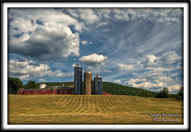
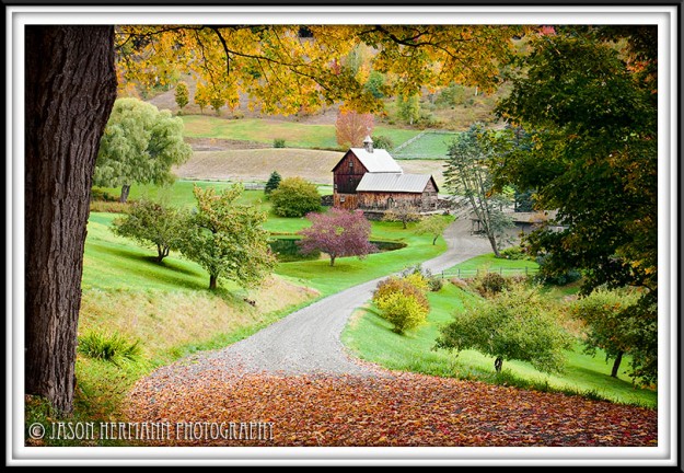
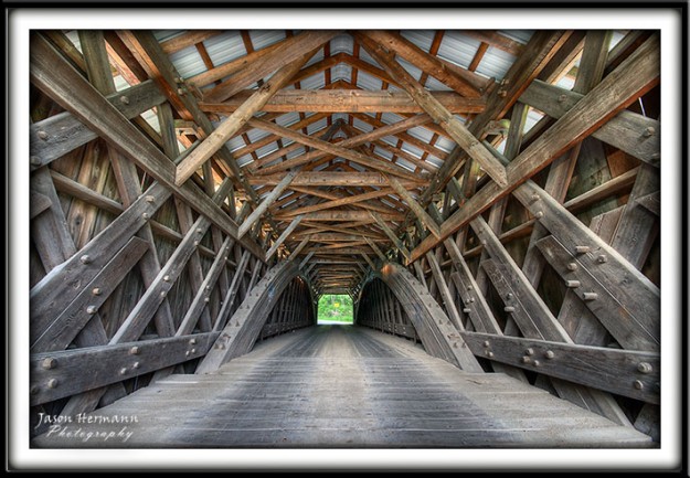
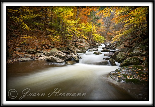
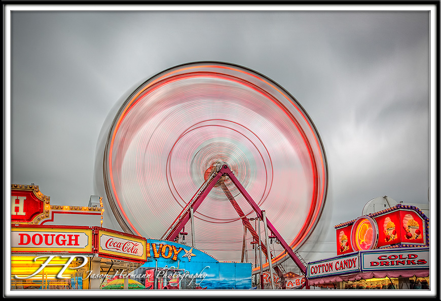
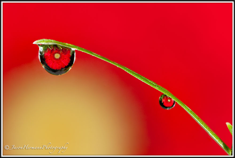
The original article Kelly Posted did not have any images, so I added a few photos to help try an illustrate each composition element discussed in the article.
Photographic Composition
When we look at a photograph, what is it about the photograph that makes us like or dislike it? Are there elements to composition that are common to photographs that receive rave reviews? For new photographers, the answer often seems elusive. Being an unschooled photographer, I take the opportunity here on the Camel to analyze the photographs that are posted to learn as much as I can about composition.
I have been pondering the art of photographic composition for sometime now, and have yet to find the definitive answer as to what constitutes excellent composition. Of course, the “definitive” answer does not exist, since so much of what we see is subjective. However, a basic set of elements does exist, and understanding those elements can help the beginning photographer create better pictures, and know how to critique.
When talking to others less experienced than me, meaning they have little or no experience, I hear the same question…how does one compose the photograph in the mind prior to taking the photograph? How does one know what to look for in a photograph when asked to critique it?
I have been looking for a book on composition, but have not yet found one. So…I decided to start this thread. I will share what I have found to be the “rules” of composition by reading this or that, and am asking, pleading, that if you have examples that illustrate these points, to share them with us here. I have seen many examples of these elements on the threads here on the Camel, but lack permission to pull the photographs into this thread.
Although for some, the art of composition comes naturally, for others, we need to train our eyes to see the world around us as an artist would. Accessing a new vocabulary allows us to see more clearly, creatively, and thus communicate with our viewers what it is that we have seen and what we want to create.
So here goes what I have been able to garner about the “rules” of composition. To many, these will be very basic. To others, who are looking for hooks on which to hang their thoughts and improve their photographs, they will be treasures. In the words of an educator, all of what we learn helps to build our schema. When our schema grows, so does our knowledge. Without our schema, we can not learn. So here is to all who need to broaden their schema:
Focal Point – The Center of Interest
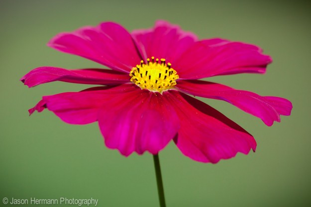
Each photograph needs to have a focal point, the main part of the picture that captures the eye. The focal point should be clear and obvious. Other elements within the photograph should not compete with the focal point. At times, we look at a photograph that someone has taken, of a landscape say, yet the image lacks a clear subject. The photograph may be of a beautiful flower garden, but without a focal point, it is merely a backdrop lacking a subject.
The Rule of Thirds
One of the most basic “rules of composition” but one, that when it is not clearly explained, seems very mysterious to the novice. I remember when I first learned about the rule of thirds several years ago. The explanation lacked a picture, and forever I was mystified as to what was meant by the rule of thirds.
Simply put, imagine taking a photograph and folding it into thirds vertically, then horizontally, much like one would fold a letter to place it in a business envelope. The result would be the photograph being divided equally into nine rectangles. The lines moving through the photograph horizontally have divided the photograph into three horizontal sections. The lines moving through the photograph vertically have divided the picture into three vertical sections.
Placing the most important elements along one of the four lines, either horizontally or vertically, creates a more pleasing and dynamic image. Placing important action at the intersection of two of the lines aids in developing a pleasing image. Subjects placed along one of the lines should also create some sort of momentum that moves the eye of the audience towards the center of the picture, not away.
Lines
Learning to see naturally occurring lines and using them in photographs is another important element. Simple lines in a photograph include bridges, roads, train tracks, planks, etc. Often lines can be seen by repeated objects, for example, a row of pews in a church.* Be aware of the lines that occur and how they can be used to provide contrast or interest in a photograph.
Leading Lines
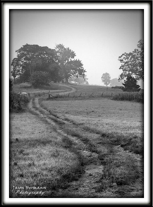
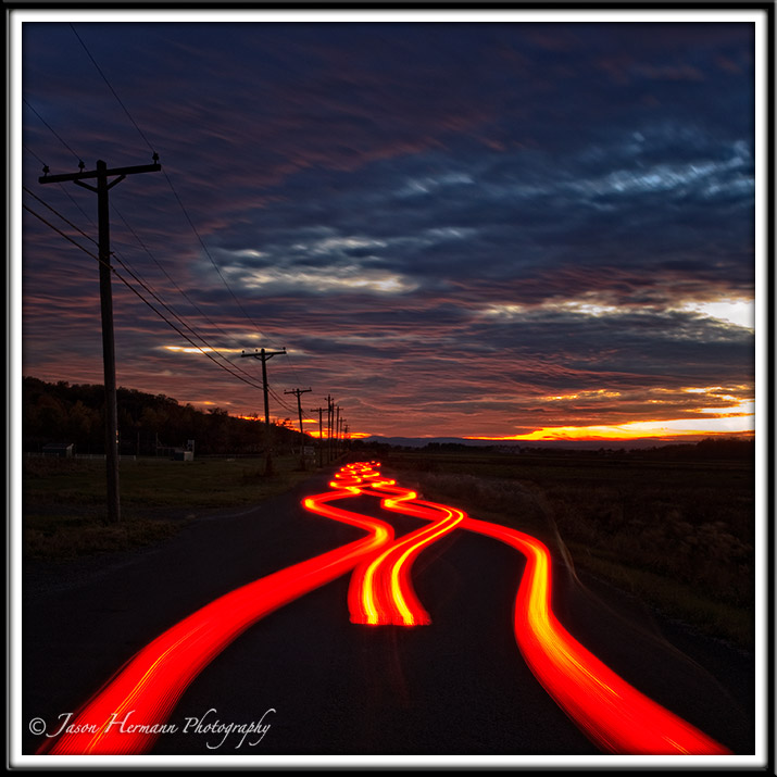
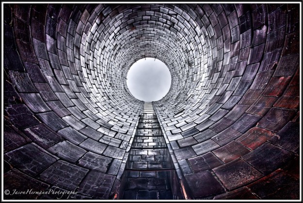
Learn to look for lines and how they cause the eye to converge upon the subject. Once again, lines created by roads, fences, bridges…anything that creates a line, can lead the eye of the viewer deeper into the photograph and to the intended subject. Be careful that lines do not cut into your subject. For example, be careful that a fence or a handrail does not run into the head of a bride, in one ear and out the other.
Curves
Curves provide elegance and grace to an image. As you examine what you would like to photograph, look for naturally occurring curves that can also be used as leading lines. Sometimes, lines and curves can be used in the same photograph to create contrast. The human form is made of curves. How can these curves be used more creatively? Other curves include winding roads, rivers, flower borders, etc. Learn to see the curves and how they relate to your subject.
Space
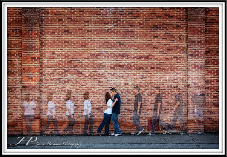
The use of space, it seems, is very subjective, but it is an important element of composition. Space helps create the mood you are wanting to communicate through your image. Be aware of how space, in relationship to your subject, can create different moods. I am thinking of one of Gabe’s pictures in weddings. He recently shot a couple’s engagement pictures, and in one of the pictures he placed the embracing couple in the lower left third of the photograph, leaving the rest of the photograph empty. This creative use of space allowed the viewer to see the importance of the relationship between the couple.
Texture
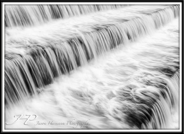
Although the images we create are not three dimensional, the objects we photograph are. Every three dimensional object has texture. How can the textures around you help create an image you are wanting to create? I am thinking of Cedric’s pictures. Cedric uses textures well when he creates his images of his boats and water. In one picture in particular, the texture of the churning water contrasts with the more placid texture of the water at river’s edge. The texture of the water contrasts with the buildings along the side of the river. In other Cedric pictures, he has left the shutter open to create a cotton candy texture to flowing water. The use of texture in this manner creates a feeling of awe. In other pictures, I have seen a soft, fluffy blanket used next to the skin of a baby. These complementary textures helped create a softer image.
Contrast
Contrast is not limited to color, or shades of gray, light and dark. Anything can help create contrast. Curved lines can contrast with straight lines. Smooth textures can contrast with rough textures. Youth can contrast with age. Looking for contrast and incorporating them into images can enhance the overall quality.
Story
Pictures can be dynamic or static. A static picture tells no story, where as dynamic pictures tell a story. Photographs, even photographs that have little or no action, can tell a story. A story has a beginning, a middle and an end. Examine your photographs to determine if there is a beginning, middle and end. As someone reads your photograph, what story are you telling them? Sharing a story through the image you creates an emotional connection between the viewer and the image. As you learn to tell the story in your pictures, you will gain status as a photographer because your photographs will be more memorable.
Keyhole to the Heavens
Surprise
One of the elements of story telling that can be incorporated into photographs is the element of surprise. One of the clearest examples of surprise is a photograph submitted by Gabe. Some folks did not care for it, I loved it. The street scene of this wedding photograph looked innocuous at first. A poster in a storefront window appeared to be the subject of the image, or perhaps it was the pedestrians walking away along the sidewalk. But then, emerging through the glass, a bride and groom stole a kiss while the world passed by. For me, this element of surprise worked. When I spotted the bride and groom, I gasped, because they surprised me. I did not expect to see them where I did. Once I spotted them, the whole composition came to life, and the story unfolded. To me, it was brilliant.
Notice the couple in the doorway
Action
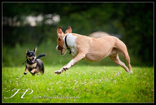
For me, as much as possible and wherever possible, action should be incorporated into images. Action aids story telling. The action can be subtle, or it can be bold, depending on the subject. Action aids story telling, story telling aids emotional connection with images, and emotional connections make the photographer, as well as the photograph, memorable.
Depth of Field
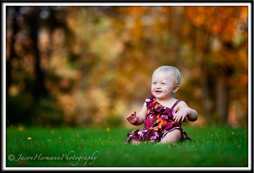
Another one of the basics. Learning to control the depth of field is an important element of good composition.
Closing Remarks
That is all for now, and a big Thanks to Kelly Lyle for letting me use his article on Photographic Composition!! Also, be sure to visit Kelly’s website at KellyLylePhotography.com!!
Jay


